Widgets
When to use?
If pages are huge because of increased business-specific logic with duplicate implementations
The layer is good to start using the methodology 🚀
Description
This is usually where independent and complex page widgets are located, composing the underlying layers
The layer was introduced as an experimental one to solve the existing problems when using other layers
So far, no best practices have been developed for this layer (apart from those that apply to other layers), so use it only if necessary and consciously
Examples
Application header
Header is a fairly common part of web applications
At the same time, more and more often in practice there are examples when we do not have "one single header for the entire application", but differs from page to page
And if the first option is easy to implement, then everything becomes not so trivial with the second one:
- Or the reused component of the header is located in the wrong place of the structure, which causes cross-imports
- Or they duplicate the implementation of the header on each page (especially when one header is used in half of the pages, and the second one is used in the other half)
The widget layer is designed to help with this case
import { SearchBar } from "features/search-bar";
import { Layout } from "shared/ui";

// The header may differ from page to page
// At the same time, this logic must be composed somewhere
export const Header = ({ theme, withSearch, withNav ...}: Props) => (
    <Layout.Header theme={theme}>
        {withSearch && <SearchBar ... />}
        {withNav && <Navigation ... />}
        ...
    <Layout.Header>
)
import { Header } from "widgets/header";
import { Layout } from "shared/ui";

export const SomePage = () => (
    <Layout>
        {/* Header#1 on one page */}
        <Header sticky={true} />
        <Layout.Content>
            ...
        </Layout.Content>
    </Layout>
)
import { Header } from "widgets/header";
import { Layout } from "shared/ui";

export const AnotherPage = () => (
    <Layout>
        {/* Header#2 on another page */}
        <Header extra={...} theme={...} />
        <Layout.Content>
            ...
        </Layout.Content>
    </Layout>
)
Tweet Card
import { ShareTweet } from "features/tweets/share";
import { LikeTweet } from "features/tweets/like";
import { TweetCard } from "entities/tweet";
import { UserThumbnail } from "entities/user";

// The component uses a template for tweets from the entities layer
// At the same time it provides it with certain features-actions,
// which the entities layer is not supposed to know about because of its scope of responsibility
//
// Other features and entities are also used here (e.g., AuthorThumbnail)

// At the same time, if such a composition was usually carried out at the page level,
// Now, such logic becomes reused
// and takes away some of the responsibility from the pages
//
// Because of which the pages contain only the most necessary logic
// (and become thin thanks to this approach)
export const TweetItem = ({ data,...}: Props) => (
    <TweetCard
        before={<UserThumbnail withPopup={true} />}
        data={data}
        ...
        extra={[
            <LikeTweet key="like" tweetId={data.id} ... />
            <ShareTweet key="share" tweetId={data.id} ... />
        ]}
    />
);
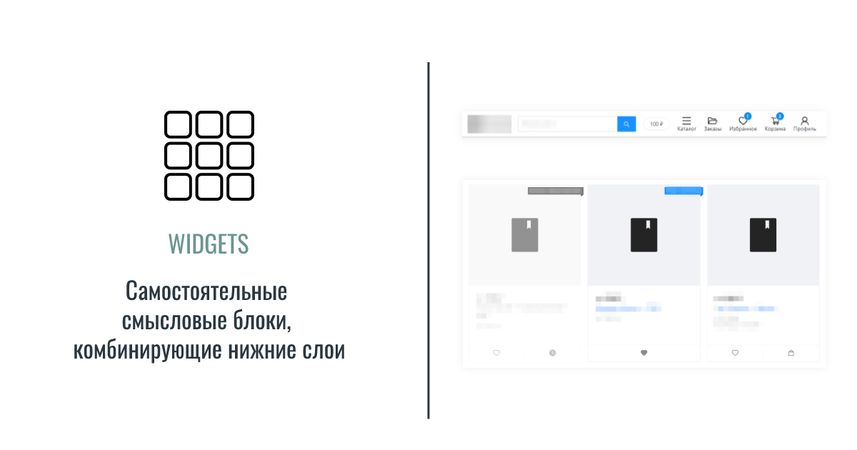
Product card
Similar to the tweet card